


Mobile Website Testing on Real Devices and Browsers
Emulators say it works. Your users on a three-year-old Android on patchy 4G say otherwise. Test your site on mobile with TestGrid: real browsers, simulated network conditions, and the evidence to fix whatever breaks.

Test Your Site on Mobile in Three Steps
Choose the Android or iOS device and OS version you need, open an available mobile browser, enter your URL, and start exploring. Work through the site manually, or target the same device-browser configuration with a compatible automated suite for repeatable regression coverage.
Request Free Trial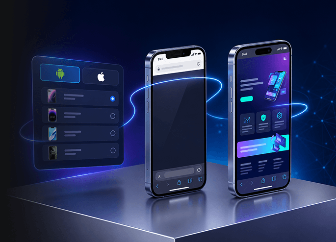
A Mobile Website Test That Uses Fingers, Not a Cursor
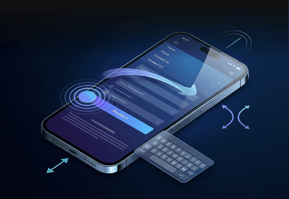
A mouse click won’t tell you that the Pay Now button is hidden behind the on-screen keyboard. Tap, swipe, pinch-zoom and type your way through sign-in and payment on a real device, and confirm every gesture does what your users expect.
Mobile-Friendly Layouts, Checked on Actual Screen Sizes
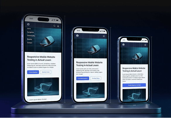
See your site layout at each device’s actual screen dimensions, in portrait and landscape using TestGrid. Analyze breakpoints, menus, overlays, fixed elements and touch targets for clipped text, overlaps and controls that vanish on one particular screen.
Mobile Browser Testing on the Browsers Your Analytics Actually Show
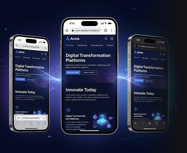
Your users aren’t all on Chrome. Run your site on Safari, Firefox, Edge, Samsung Internet and Opera across the device and OS versions available on TestGrid, then compare how each one renders, runs JavaScript and handles forms. When something breaks on only one combination, you’ll know exactly which one.
Request Free TrialMobile Site Testing for Connectivity Interruptions
Throttle the network to 2G, 3G, 4G or 5G speeds with TestGrid and watch how pages, requests and checkout hold up. Where the device allows it, switch to airplane mode mid-flow and find out whether or not your site recovers.

Test Your Website for Mobile Users in Miami, Munich, and Mumbai
Prices in the right currency, content in the right language, offers that only run in one region. Simulate GPS and IP locations to preview what each market actually experiences, without leaving your desk.

Debug From the Exact Session That Failed
Testing by hand? Hit record on TestGrid before you start and stop when you’re done. The full session is there to replay, so a bug you spot manually comes with proof. When you need to dig deeper, open HAR files and browser developer tools on compatible sessions.
Request Free Trial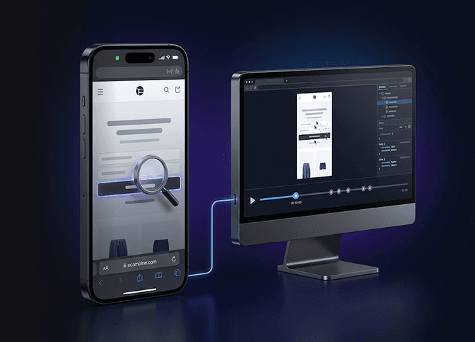
Run the Automation You Already Have
Execute Selenium, Playwright, Cypress, WebdriverIO and other compatible suites on TestGrid as they are, with no rewrites and no assertions. Run them in parallel and trigger them from Jenkins, GitHub Actions, GitLab or Azure DevOps.

Validate Your Website on Mobile Devices Before It Goes Live
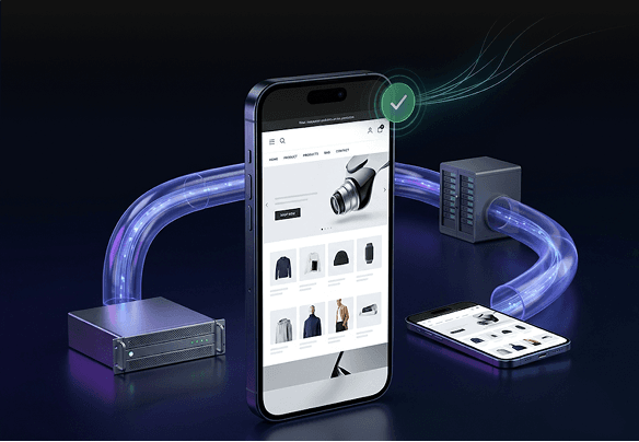
Connect localhost, staging, VPN-protected and internal sites through secure tunneling. Catch mobile bugs in the environments your team already works in, long before any customer uncovers them with TestGrid.
Mobile Website Testing on Your Own Infrastructure
Security reviews shouldn’t be the reason your website never reaches a real phone – TestGrid ensures that.
Deploy on your terms
Run TestGrid in a private dedicated cloud, on-premises or hybrid, sized to your capacity, so every mobile website test stays within your data-handling rules.
Extend the device lab you already own
Add the phones and tablets you’ve invested in to your TestGrid setup. When your lab is missing a model, mobile browser or OS version, use a hosted one instead.
Control access to every device
From one place in TestGrid, reserve hardware, assign permissions and set usage policies across your hosted and in-house lab. No more teams queueing for the same phone.
Frequently Asked Questions (FAQs)
Is Chrome DevTools device mode enough to test my website on mobile?

Chrome DevTools is useful for responsive layout checks, simulated touch interactions and network throttling. However, it can’t fully reproduce physical-device performance, native mobile browser behavior or hardware-specific issues, including differences between desktop Chrome and iOS Safari.
Is Chrome DevTools device mode enough to test my website on mobile?
Chrome DevTools is useful for responsive layout checks, simulated touch interactions and network throttling. However, it can’t fully reproduce physical-device performance, native mobile browser behavior or hardware-specific issues, including differences between desktop Chrome and iOS Safari.
Can I test on iPhone Safari without owning an iPhone or a Mac?
Yes. Open a real iPhone in TestGrid’s Real Device Cloud from your browser, launch Safari and enter your URL. Your team can reproduce iOS-only bugs from Windows or Linux machines.
Can I test on iPhone Safari without owning an iPhone or a Mac?
Yes. Open a real iPhone in TestGrid’s Real Device Cloud from your browser, launch Safari and enter your URL. Your team can reproduce iOS-only bugs from Windows or Linux machines.
How many devices should I use to test my website for mobile?
Start with your analytics: the device models, OS versions and browsers that cover most of your mobile traffic, plus at least one older, lower-end Android. Expand as traffic shifts or a release adds risk.
How many devices should I use to test my website for mobile?
Start with your analytics: the device models, OS versions and browsers that cover most of your mobile traffic, plus at least one older, lower-end Android. Expand as traffic shifts or a release adds risk.
Why do I need to test websites on mobile devices?
Most web traffic now comes from phones, and mobile visitors rarely give a broken page a second chance. A clipped layout, an unresponsive button or a checkout that fails on one browser costs you users you never hear from.
Why do I need to test websites on mobile devices?
Most web traffic now comes from phones, and mobile visitors rarely give a broken page a second chance. A clipped layout, an unresponsive button or a checkout that fails on one browser costs you users you never hear from.
When should I test my site on mobile?
Before every release, and whenever you change something users touch: navigation, forms, checkout, breakpoints, third-party scripts or browser-specific features. Run your regression suite on each build and explore new flows hands-on.
When should I test my site on mobile?
Before every release, and whenever you change something users touch: navigation, forms, checkout, breakpoints, third-party scripts or browser-specific features. Run your regression suite on each build and explore new flows hands-on.
How do I measure my website’s performance on mobile?
Load your site on real devices over realistic networks and track Core Web Vitals: Largest Contentful Paint under 2.5 seconds, Interaction to Next Paint under 200 ms and Cumulative Layout Shift under 0.1. Repeat on slower connections and older phones.
How do I measure my website’s performance on mobile?
Load your site on real devices over realistic networks and track Core Web Vitals: Largest Contentful Paint under 2.5 seconds, Interaction to Next Paint under 200 ms and Cumulative Layout Shift under 0.1. Repeat on slower connections and older phones.